Our calligraphy guild was super blessed to have Lisa Engelbrecht teach us a "lettering on fabric" workshop. I have had so many opportunities to use the techniques that she taught me and I have used them over and over again! Lisa continues to be a huge inspiration to me and is missed and loved. I think of Lisa every time I letter on fabric.
I absolutely love combining my rubber stamp passion with my love of calligraphy and marrying the fabric and paper together! I have made so many fabric/paper books. It's truly my addiction. The book I made was using scraps left from other projects - different sizes, colors, and textures. I am using rubber stamps and calligraphy on the pages. My book is almost complete - an easy theme of "Life is Good".
Let Them Eat Cake!
I saw this project in an old Somerset Studio issue and it was very interesting to me. If you see something you want to make, you just have to know that you'll be engineering it yourself because as with ALL Somerset Studio project articles, the instructions are always incomplete. The good news is that this was my first attempt and I learned a lot of what to do and what not to do. Already I am looking forward to making the next cake. Look out Betty Crocker!
Labels:
altered books,
art projects,
paper cake,
rubber stamps
Violet
Judi's altered book with the story of Violet was super interesting and fun to do. It was my thought to do a "Dada" poetry idea. Instead of rearranging words, I took four pages and took sentences from those pages to reinvent the ending since I was the last artist to work in her book.
I took the beginning page of Judi's as my start of the story line.
I was thrilled to find in my stash of vintage ephemera, TheCunard Steam-Ship Company brochures which was a perfect background Violet's story.
This photo was inside the brochure and I thought the conversation I wanted to add fit so well.
The rubber stamp image is from B-Line Designs named "Chris". I enjoy having this stamp in my collection as he is named for my brother, Chris - pretty darn cool. I thought the image worked well with the gentleman visiting with Violet and not yet described in the story. I stamped the image onto a copy of the ship's crew list.
I made the assumption that this conversation was a continuance from the same gentleman she has met above and is a welcomed distraction for her.
This is another great stamp from B-Line Designed named "Michelle" which is named after my sister-in-law who is married to my brother Chris. They are good friends of Beverly who owns and designs her stamps. She names her stamp images after her close friends.
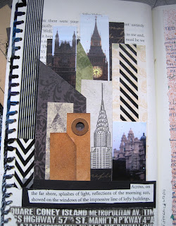
I saw this idea in a visual journal book and thought it was a great idea for creating a skyline. I did have an Empire State building stamp and took liberties in using a Big Ben image along with others from the UK to now be a part of the NYC skyline. It's all made up anyway.
I used a vintage customs declaration as the background for this text entry and giving explanation for Violet's extended stay in NYC.
I stamped the telephone image onto mulberry paper and added diamond glaze for the dial numbers. I was thrilled to locate a conversation where Violet has decided to contact Edwin's office. Of course, the response has to be highlighted by the red metal file pull.
This page was highlighted by the rubber stamp image of what could be Violet's expression after receiving a response from Edwin. And of course, she has thoughts about her past.
This page is intended to give the viewer a feeling of reflection.....
a yin and yang for destruction and goodness.
I was thrilled to find the text above and rearrange them in a manner that left the reader with the option of believing Edwin appeared in person and all is well or if in a dream.... perhaps to be continued. The final text entry is the name of the book "Dancing Backwards".
I made an insane number of page entries but since I was the last artist working in Judi's book, I gave myself permission as I knew I was not taking away pages from the others. When I gathered all the text that I wanted to use and sorted them in the order that I wanted the story to be told, it took a number of pages. After the text was selected, it was easy enough to decide on the background images.
Finding Minnesota - Jan's Alpha Book
Jan's book was a whooping huge size, however, once I selected the "M", the theme of Minneapolis and Minnesota made it easy.
I was almost tempted to do another letter but unfortunately I didn't have the time.
Subscribe to:
Comments (Atom)


