Showing posts with label round robin project. Show all posts

Violet

Judi's altered book with the story of Violet was super interesting and fun to do.  It was my thought to do a "Dada" poetry idea.  Instead of rearranging words, I took four pages and took sentences from those pages to reinvent the ending since I was the last artist to work in her book. 
I took the beginning page of Judi's as my start of the story line.
I was thrilled to find in my stash of vintage ephemera, TheCunard Steam-Ship Company brochures which was a perfect background Violet's story.
This photo was inside the brochure and I thought the conversation I wanted to add fit so well.
The rubber stamp image is from B-Line Designs named "Chris".  I enjoy having this stamp in my collection as he is named for my brother, Chris - pretty darn cool.  I thought the image worked well with the gentleman visiting with Violet and not yet described in the story. I stamped the image onto a copy of the ship's crew list.
I made the assumption that this conversation was a continuance from the same gentleman she has met above and is a welcomed distraction for her.
This is another great stamp from B-Line Designed named "Michelle" which is named after my sister-in-law who is married to my brother Chris.  They are good friends of Beverly who owns and designs her stamps.  She names her stamp images after her close friends.
I saw this idea in a visual journal book and thought it was a great idea for creating a skyline.  I did have an Empire State building stamp and took liberties in using a Big Ben image along with others from the UK to now be a part of the NYC skyline.  It's all made up anyway.
I used a vintage customs declaration as the background for this text entry and giving explanation for Violet's extended stay in NYC.
I stamped the telephone image onto mulberry paper and added diamond glaze for the dial numbers.  I was thrilled to locate a conversation where Violet has decided to contact Edwin's office.  Of course, the response has to be highlighted by the red metal file pull.
This page was highlighted by the rubber stamp image of what could be Violet's expression after receiving a response from Edwin.  And of course, she has thoughts about her past.
This page is intended to give the viewer a feeling of reflection.....
a yin and yang for destruction and goodness.
I was thrilled to find the text above and rearrange them in a manner that left the reader with the option of believing Edwin appeared in person and all is well or if in a dream.... perhaps to be continued.  The final text entry is the name of the book "Dancing Backwards".

I made an insane number of page entries but since I was the last artist working in Judi's book, I gave myself permission as I knew I was not taking away pages from the others.  When I gathered all the text that I wanted to use and sorted them in the order that I wanted the story to be told, it took a number of pages. After the text was selected, it was easy enough to decide on the background images.

Finding Minnesota - Jan's Alpha Book

Jan's book was a whooping huge size, however, once I selected the "M", the theme of Minneapolis and Minnesota made it easy.


I was almost tempted to do another letter but unfortunately I didn't have the time.

"Define It" by Sharon

Sharon loves letter forms and words in addition to being a mixed-media artist.  She was recently a guest artist in Stamper's Sampler summer issue featuring her amazing cards along with a wonderful interview.  She altered an existing calendar for "Define It" giving each participating artist an opportunity to use images, photos and rubber stamping to define their chosen letter.  I selected the letter "P" for Pisces.  I so enjoyed working in her book! 
I love the idea of altering an existing calendar and I'm now inspired to alter one from my personal stash!

I adhered blue mulberry paper to represent water.
Loved using my Pisces stamp!  I added star embellishments everywhere there was a star in the stamp design.  To emphasize the theme, I added text using a label gadget.
The images of the bathing beauties are from Graphic 45. 
The fish man is one of my favorite rubber stamp images.  He so much fun to dress in different clothes which takes a bit of fussy cutting and planning but worth all the effort!
I think Sharon will especially enjoy the collage work on this page.  It was fun adding different textures.
This was my last page - Sharon requested that we do four pages.  I added the yarn to the edges of each page and sewed tabs using the extra canvas from the background I used on the 1st page.  I dyed the canvas material using Tim Holtz sprays and stencils several years ago for a major project.  I have small sizes left that I enjoy using in my art.  My stash is almost depleted and I will need to take time to do more.   It's a messy process and I like doing a bunch so I have a supply on hand.
The odd shapes are from a piece of jewelry that I took apart.  I think they make interesting "pretend" stones or shells.  I added bling where the hole was drilled.

Marsha's Vintage Faux Album

I loved Marsha's theme of original photos
from Opal Thorpe's photo album
making fictional stories of her life.


I couldn't resist the idea of both of them loving each other's home
however, in the end loving their own country's home more.

Pat's Nature Journal

I enjoyed being the first participant to contribute to Pat's book. I find for myself that I am more free to implement my ideas because no one else has done them in her book yet.

Merci

Paris was an easy theme for my friend Sharon. I chose her favorite color of card stock, then stamped French text.  Embossing in white was a nice contrast and added texture. Her address was written on a tiny slip of paper tucked in the typewriter. (I would have typed her address if I hadn't sold my antique typewriter at a moving sale) Thank you Susan for the red Express Special Delivery label. She scored a variety of labels on Ebay and generously sent me some! The Paris post is a rubber stamp, the train ticket is from my Paris trip and the typewriter image from Catherine Moore.


This was the photo of the backside of the postcard before mailing. I added an Eiffel Tower brad, punched the fleur de lis, and the final addition of the letters were made using Tim Holtz's alterations alpha. I cut both colors of card stock at the same time. I blessed Sharon's postcard "done" at this point and I was ready to mail.....but wait......
Then Ania brought into the office yummy chocolate treats. I couldn't resist trimming the "Merci" from the candy wrapper and adding it to the art piece...an Aha Moment. We all agreed that it was the perfect touch!  Don't you just love it when things like that happen?!

Letter for Minori

Minori, who lives in Japan has been one of the original players in our art group.  I have gotten to know her over the years and she is an awesome artist and friend.  The envelope that I used for her mail art was from a box that my husband found above ceiling tiles in an old building that was being renovated.  I have no idea why a box of envelopes would be placed there!  I took apart of the envelope and sewed the mailing label that I made for her and then reassembled the envelope.  

I wish I had taken a photo of the envelope after adhering the postage on the front of the envelope.  I used about four stamps that were all different.  The stamps added a lot of interest to the front of the envelope.
Just a note:  I think it is wise to block out addresses when posting to maintain the privacy of the recipients.
Minori loves her cats and when I found a postcard with the cat peering through the fish bowl, I knew at some point in time I would send this card to her.  I did cut around the fish bowl to make the collage more interesting.  The "Must be Delivered TODAY" sticker was sent to me from another art friend who scored a stash of vintage mailing labels from eBay.  Minori collects postage stamps so I added a few cancelled US postage stamps.  The tissue tape from the Tim Holtz collection is great to use to wrap the bottom of the envelope.  This prevents the postcard and rubber stamped card stock sentiment from getting caught on other stuff when going through the post office.  I used Claudine Hellmuth's gel medium to seal the tape which is important.  The tissue tape is removable unless you seal it.

Portal

I'll explain why I named Susan's charm for her round robin necklace "Portal". Diamond Glaze was added on top of the image and left to dry overnight. The next morning,it appeared to me as if the image was coming through a "mirror"...so hence the naming "Portal".  I apologize for the glare!
I used a watch back for the photo and attached it to a Tim Holtz gear using E-6000.
A very tiny butterfly embellishment was added before the Diamond Glaze dried. 

Mail Art for Judi

Judi is a "shoe horse".....so when the theme of "mail art" was selected for our art group, I penciled in my notebook "Shoe for Judi"!  Her response to me made it worth all my creative effort!!!  Thanks girlfriend for all the kudos!
It you want to send a mail art shoe, just be sure to follow the postal regulations.
The birdhouse wooden buttons were given to me by another art friend.  It was perfect for adhering all the flower layers together.
A rubber stamp quote was stamped onto paste paper than I had made in a calligraphy workshop.  It was serendipity that it matched the background paper so well.  I attached a tiny tag I made with hand lettered "fly" with a string.  I received years ago before birds were so popular from another artist in a swap where she added a tag in the bird's beak.  I loved that detail so much that I have added it to my many birds too.
Three small pearls from an old necklace was wired to a nest embellishment before it was secured using E-6000 glue.  A velvet green leaf was placed under the nest.  OMG, I am beyond thrilled that Judi loved receiving her shoe!

Art for Sharon

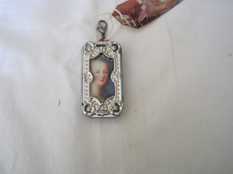
I sure hope Sharon loves the charm I made for her as I really, really, really didn't want to give it up after I made it....ever have those moments?!
The blank little tin was the perfect size I think for Sharon's round robin necklace.  Of course, she loved visiting Versailles and Paris last year.  I thought perhaps this would be a reminder of her great trip!
I used a "frame"embellishment for Marie's photo and then applied Diamond Glaze on top.
I debated with myself for a long time about which way I wanted my "locket" to open.  Since it does take effort to open it, I thought the top would not slide off and be lost. I wanted Sharon to be able to share with a possible admirer of the contents without the inside content being upside down.  On the flip side, Sharon will be the one to view it upside down if she opens it while wearing it. Hopefully, my end decision was a good one!
I did find an Eiffel Tower charm in my stash and with handy wire clippers I removed the charm's loop which allowed me to glue the charm flat against the paper using E-6000.  The little red hanger was attached to the bottom tin using my husband's tool for seting grommets.  This was my first time using this tool and it was hard for me because of the weight and size of the tool.  Definitely not made for smaller hands!  He did insist that I keep this tool for my art room, however, I will be asking him to set the grommets in my next project!

Butterfly for Barb

Another butterfly for Barb!
I hope Barb doesn't grow tired of receiving butterfly artwork......as I enjoy the butterfly theme so very much. This is a hard plastic material that I purchased from a stamp store already cut into the butterfly shape. Using a heat tool allows you to manipulate the shape of the butterfly. After coloring the one side with alcohol inks, I then collaged a dictionary page with the word butterfly.
I added a very lightweight mulberry paper to the backside of the butterfly and then misted it with a light wash of yellow which added to the transparency of the paper. You can see some of the dictionary paper behind it....love that!

Charm for Jan B.

When I received Jan B's necklace, there were so many ideas swirling around in my head for a charm that I could make. I found wooden letter tiles that I had purchased a long ago that were made to be as place-cards for dinner parties. The letters have been used in a variety of art projects, including this one! I don't think I have enough letters now to spell anyone's name but what's remaining in my collection is perfect when you only need one letter!
First, I colored the white tile with a soft ochre color and then stamped a flourish design in black archival ink. Burnt brown was applied as a border. A dimensional bubble tile on top of the "J" was added after everything was heat set.
The other artists added charms that were a bird theme, so I played along. After I adhered the image, I applied a gel medium on top for sealing. When this was dry, I added Rock Candy crackle paint by Ranger. A small smidgen ochre was applied on top.

After drilling the hole, my favorite part about the charm is the embossing powder that I used on the edge. I tried thinking about copper tape, maybe coloring the edges with gold leaf pen but that just seem didn't exciting to me....then the idea came to use embossing powder that I have owned for eons. And that was a good thing! I love the result!